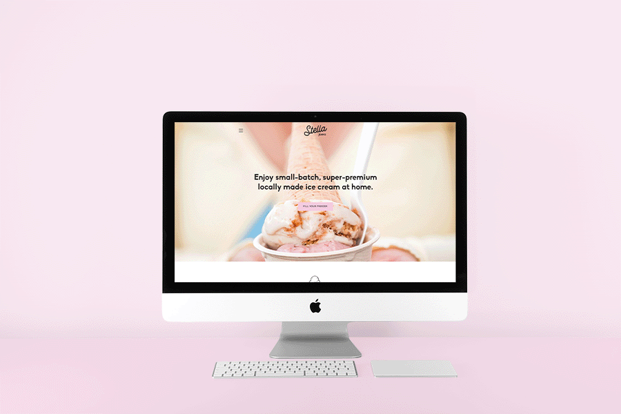
Deliciously different flavours and a penchant for creativity in all that they do sets Stella Jean’s apart as California's favourite small-batch ice cream joint. With rapid expansion on the horizon a new look and feel was due.
For their brand refresh, we wanted to maintain the spirit of their existing logo, reworking the handwritten letterforms and pairing the pleasing new wordmark with modern, edgy sans. We built out the logo suite to include a variety of secondary wordmarks and badges, allowing lots of room to play when extending the brand across multiple assets. The new palette is built around their signature coral pink, pulling in soft and creamy tones as well as an earthy olive green that speaks to their many plant-based ice cream varieties.
For their brand refresh, we wanted to maintain the spirit of their existing logo, reworking the handwritten letterforms and pairing the pleasing new wordmark with modern, edgy sans. We built out the logo suite to include a variety of secondary wordmarks and badges, allowing lots of room to play when extending the brand across multiple assets. The new palette is built around their signature coral pink, pulling in soft and creamy tones as well as an earthy olive green that speaks to their many plant-based ice cream varieties.