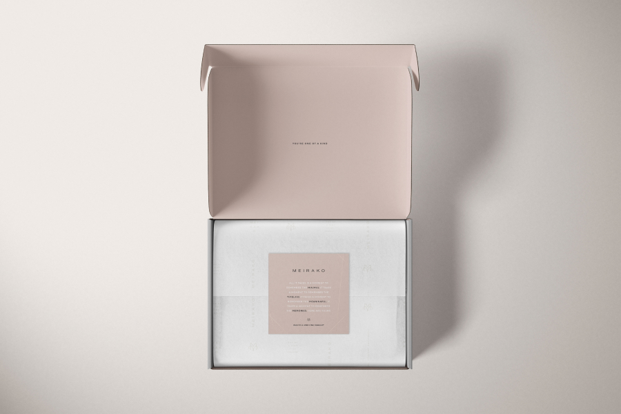
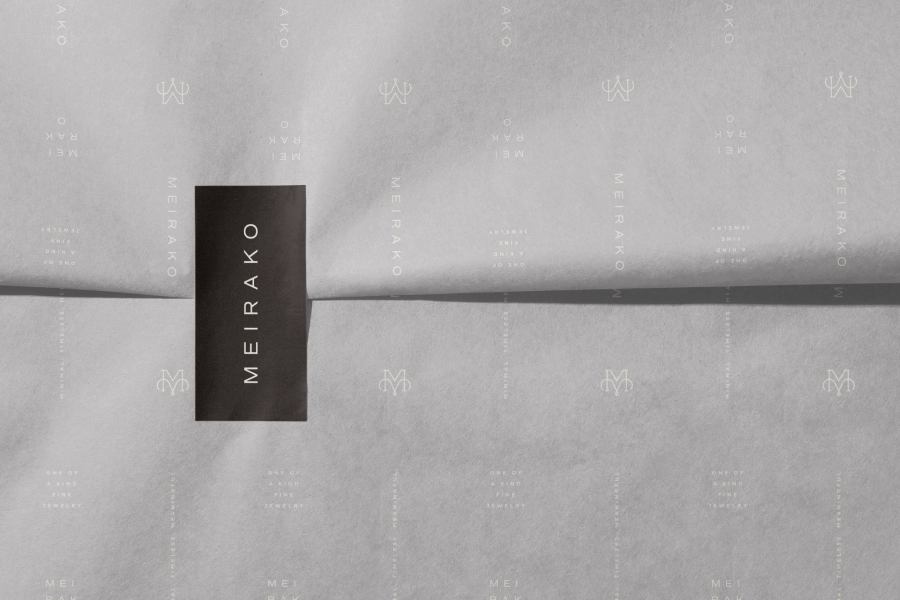
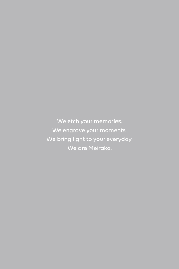
Minimal, timeless, meaningful - both the tagline and guidelines when developing the Meirako brand. From naming to visual identity to packaging design, the Meirako brand had to have a beautiful aesthetic to match their beautiful products.
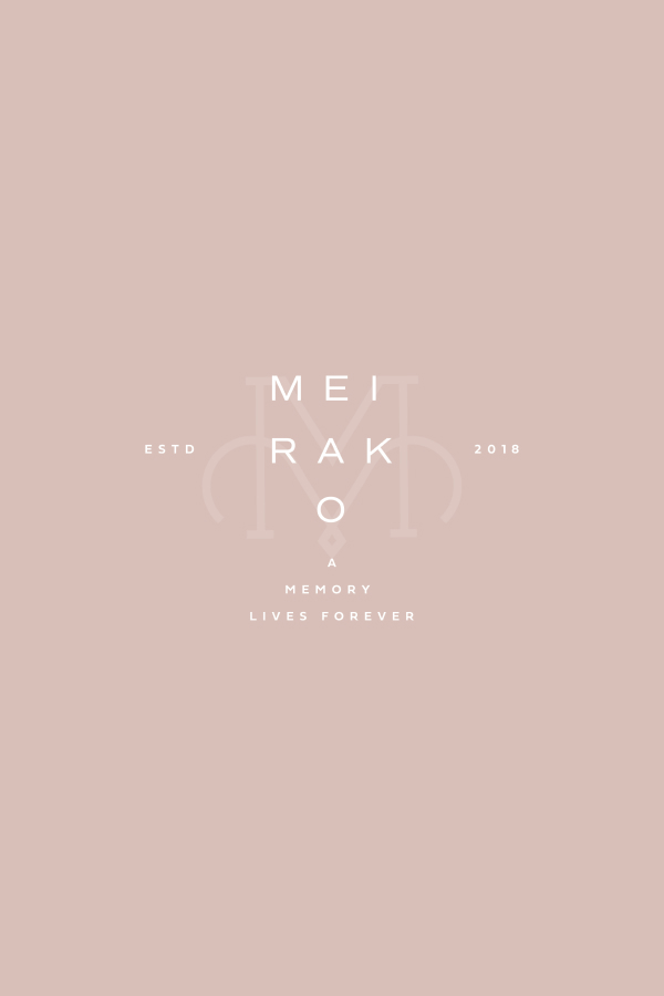
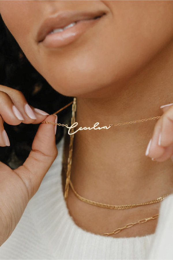
The logo font is inspired by New York wayfinding, befitting a brand that would be at home between Tiffany’s and Chanel. Knowing that the name Mierako means to give light, we tracked the letters further apart so that light can pass through. It feels bright, uplifting and, most importantly, elevated. We also included an intricate and iconic brandmark that is seemingly destined to be stamped on a jewelry box. Graphically, linear foil lines call to mind rays of light, complimenting the simplicity of the wordmark while not competing with the more ornate brandmark.
The logo font is inspired by New York wayfinding, befitting a brand that would be at home between Tiffany’s and Chanel. Knowing that the name Mierako means to give light, we tracked the letters further apart so that light can pass through. It feels bright, uplifting and, most importantly, elevated. We also included an intricate and iconic brandmark that is seemingly destined to be stamped on a jewelry box. Graphically, linear foil lines call to mind rays of light, complimenting the simplicity of the wordmark while not competing with the more ornate brandmark.