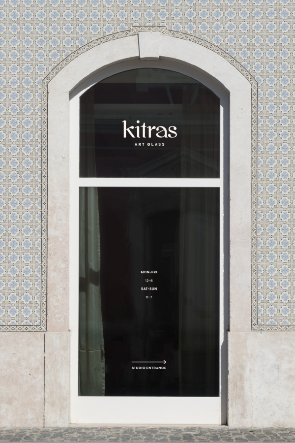
After 30-plus years in business, Kitras sought to update their brand with a new visual identity that paid homage to their previous logo and legacy while feeling modern and exciting.
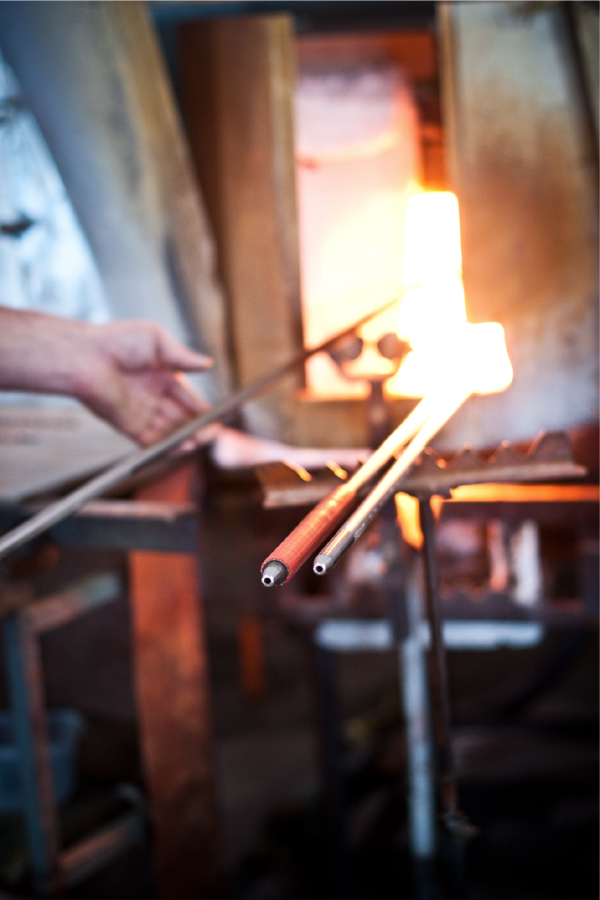
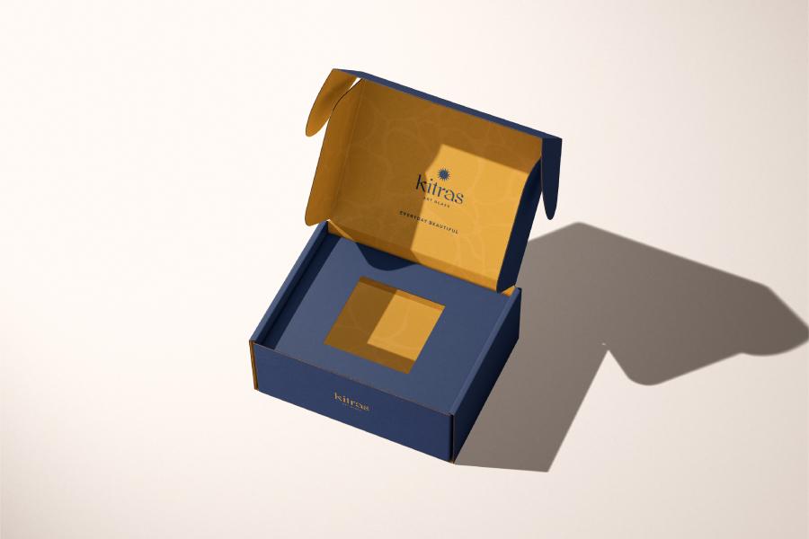
The new aesthetic pulls a palette from the colours found in blown glass as though seen through the ornaments themselves. Slightly muted so as not to compete.
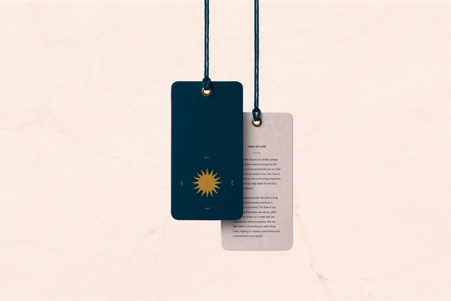
A fresh take on their beloved sun logo modernizes a familiar graphic that has served the brand for decades. Paired with a unique and organic font, the resulting logo quite feels handcrafted, fiery and in perfect balance with a subtle, earthy pattern set.
