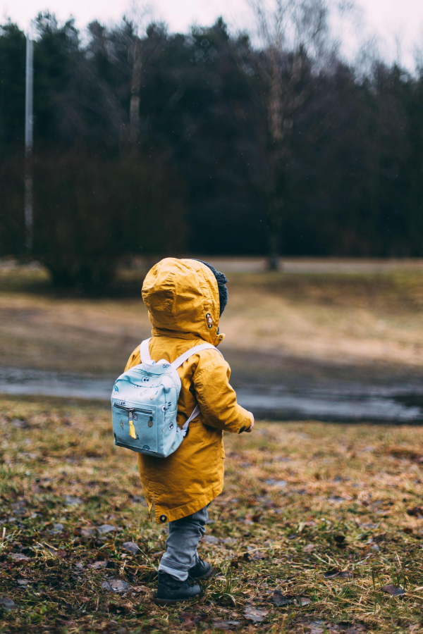
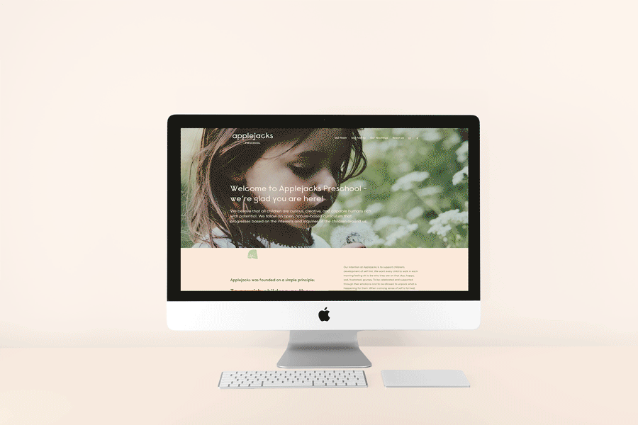
As Applejacks Preschool was getting ready to move into their new nature-inspired location, they needed a new aesthetic to embody their approach to teaching which centers around the power of play and adventure. Natural colours and textures, tinker trays and the idea that there are endless paths for children to take on their educational journey served as inspiration
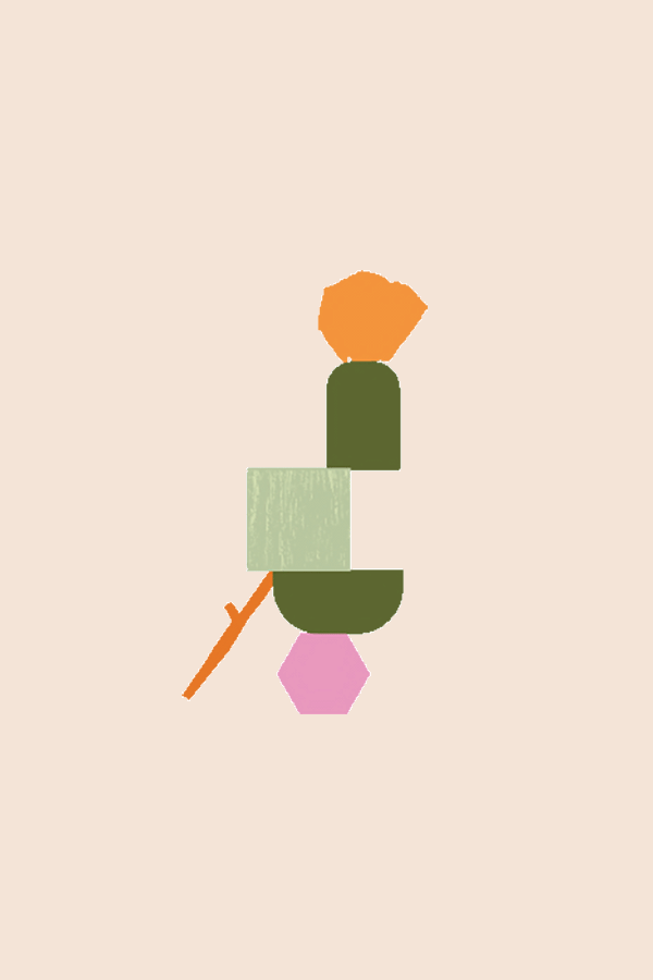
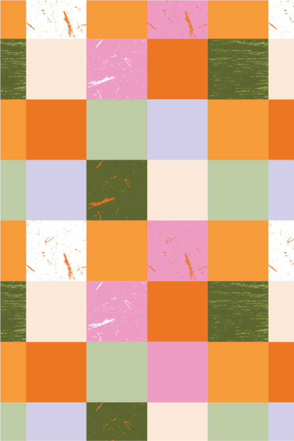
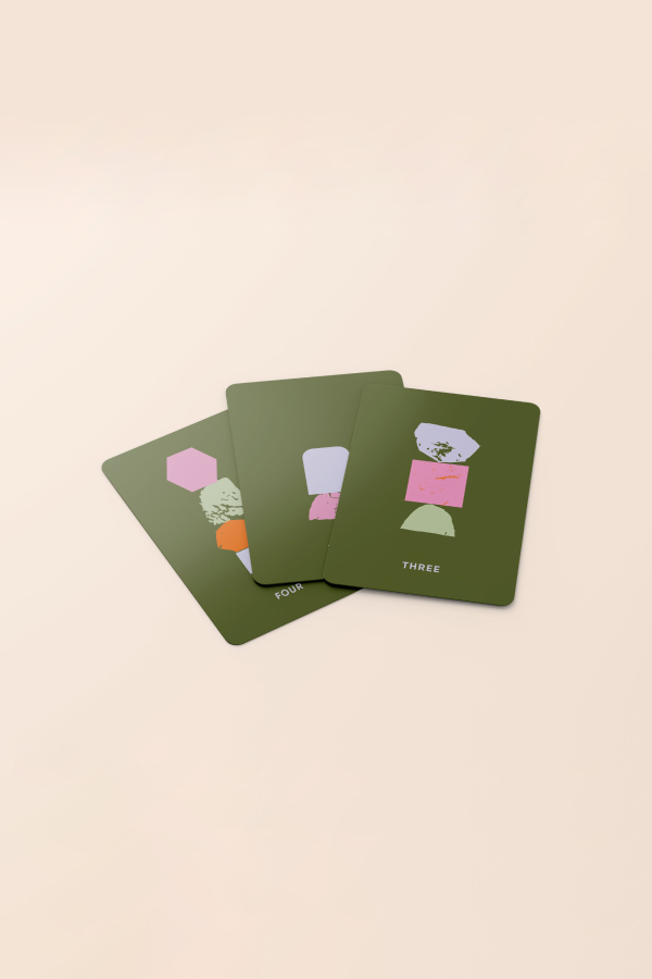
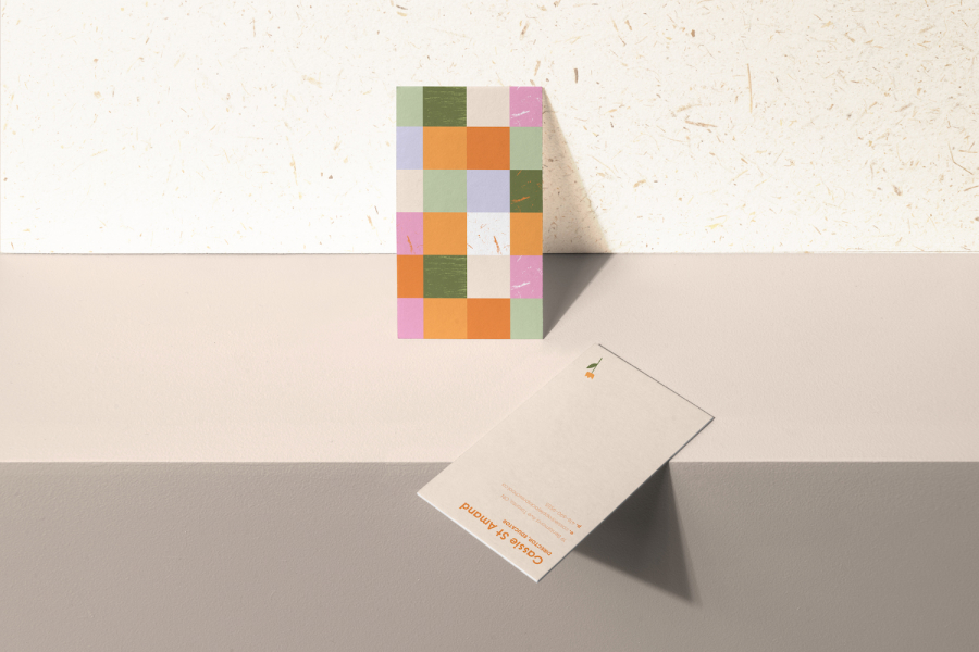
Borrowing from nature we incorporated rich greens, oranges and pinks for a friendly and fun feel that refrains from feeling overly juvenile. The lowercase wordmark, which uses a geometric sans serif built from primary shapes, feels experimental, fun and artistic. Rough shapes and blocks made from real-life potato stamps add depth to the geometric graphic suite which is used in both patterns and to add illustrative parks to digital and analog assets.
Borrowing from nature we incorporated rich greens, oranges and pinks for a friendly and fun feel that refrains from feeling overly juvenile. The lowercase wordmark, which uses a geometric sans serif built from primary shapes, feels experimental, fun and artistic. Rough shapes and blocks made from real-life potato stamps add depth to the geometric graphic suite which is used in both patterns and to add illustrative parks to digital and analog assets.